This Seuss inspired animation was created after I was given a brief to choose a quote from the website BrainyQuote.com, and make an animation inspired by the quote.
I felt that I could exercise my skills in Adobe After Effects and 2D animation with this piece. I chose a Dr. Seuss quote because he as a person and artist really resonates with me.
The Styleframes
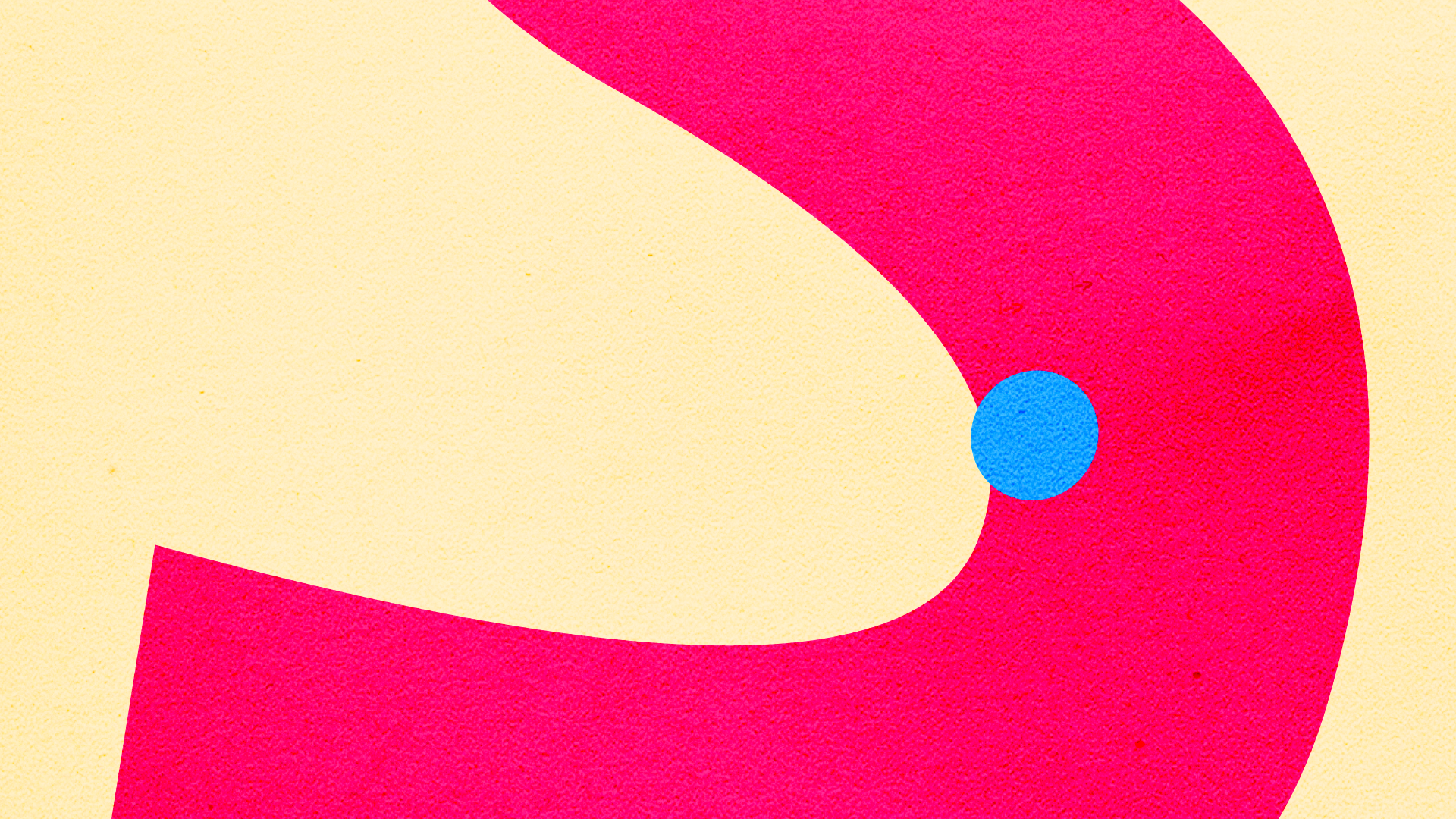
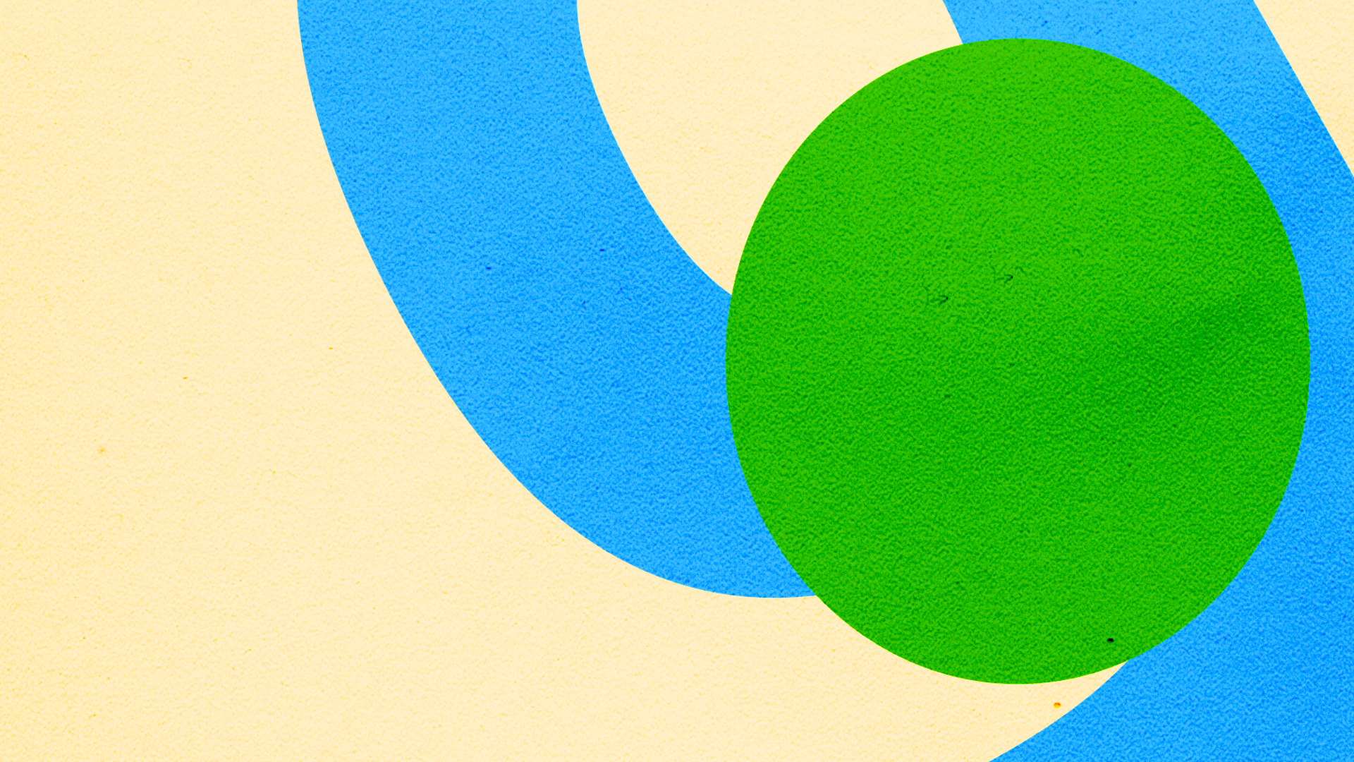
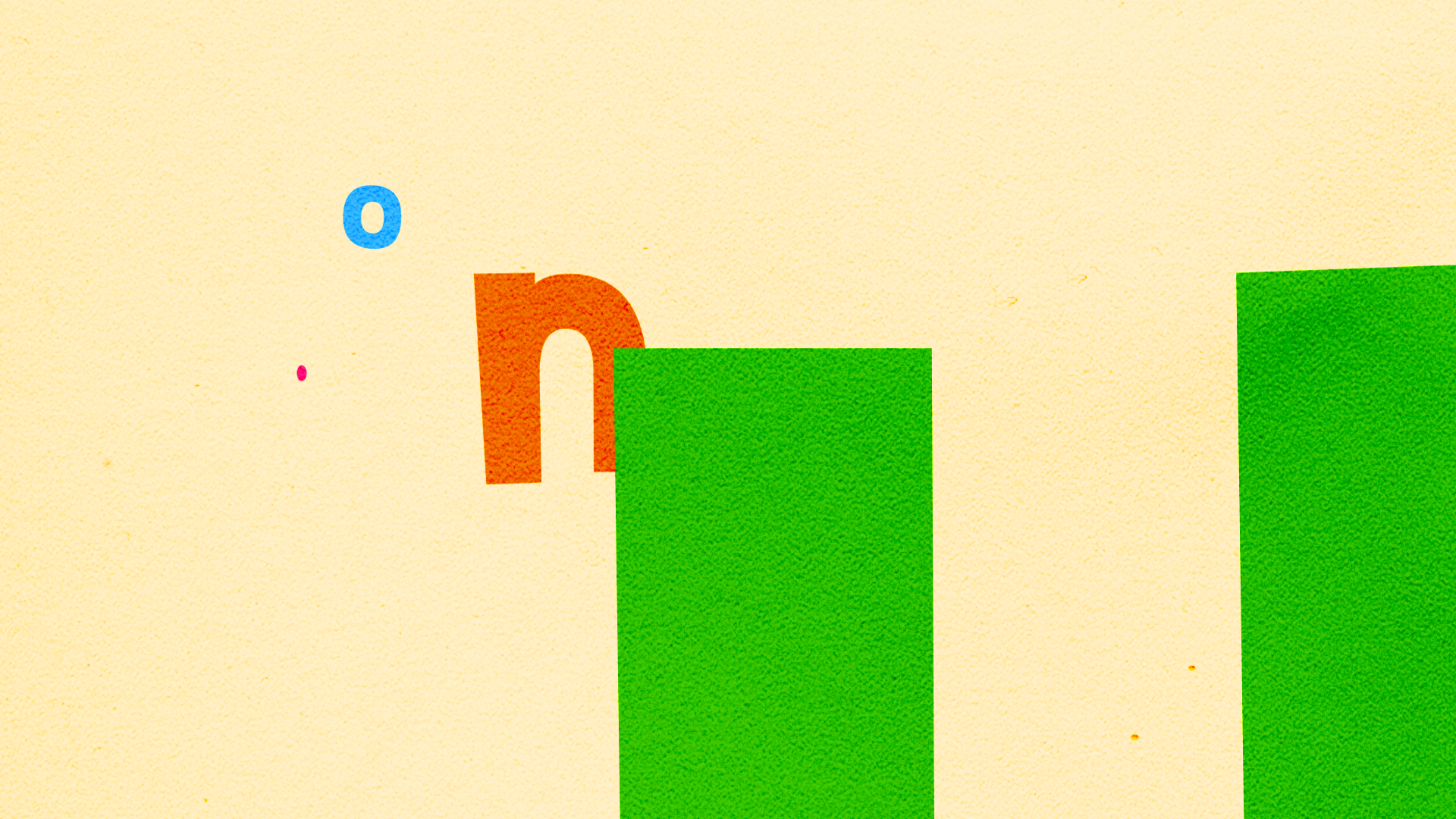

The Research
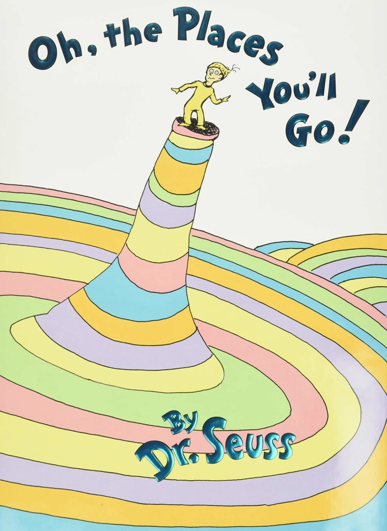
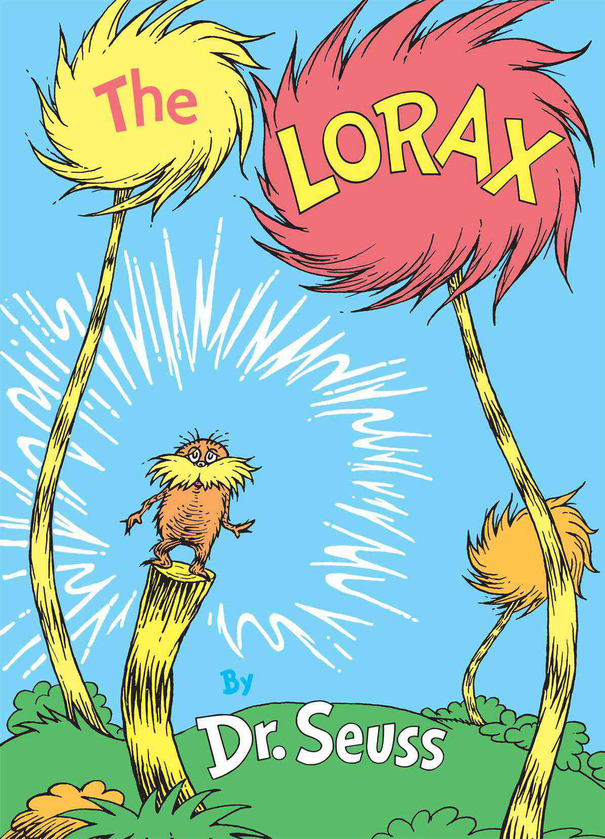
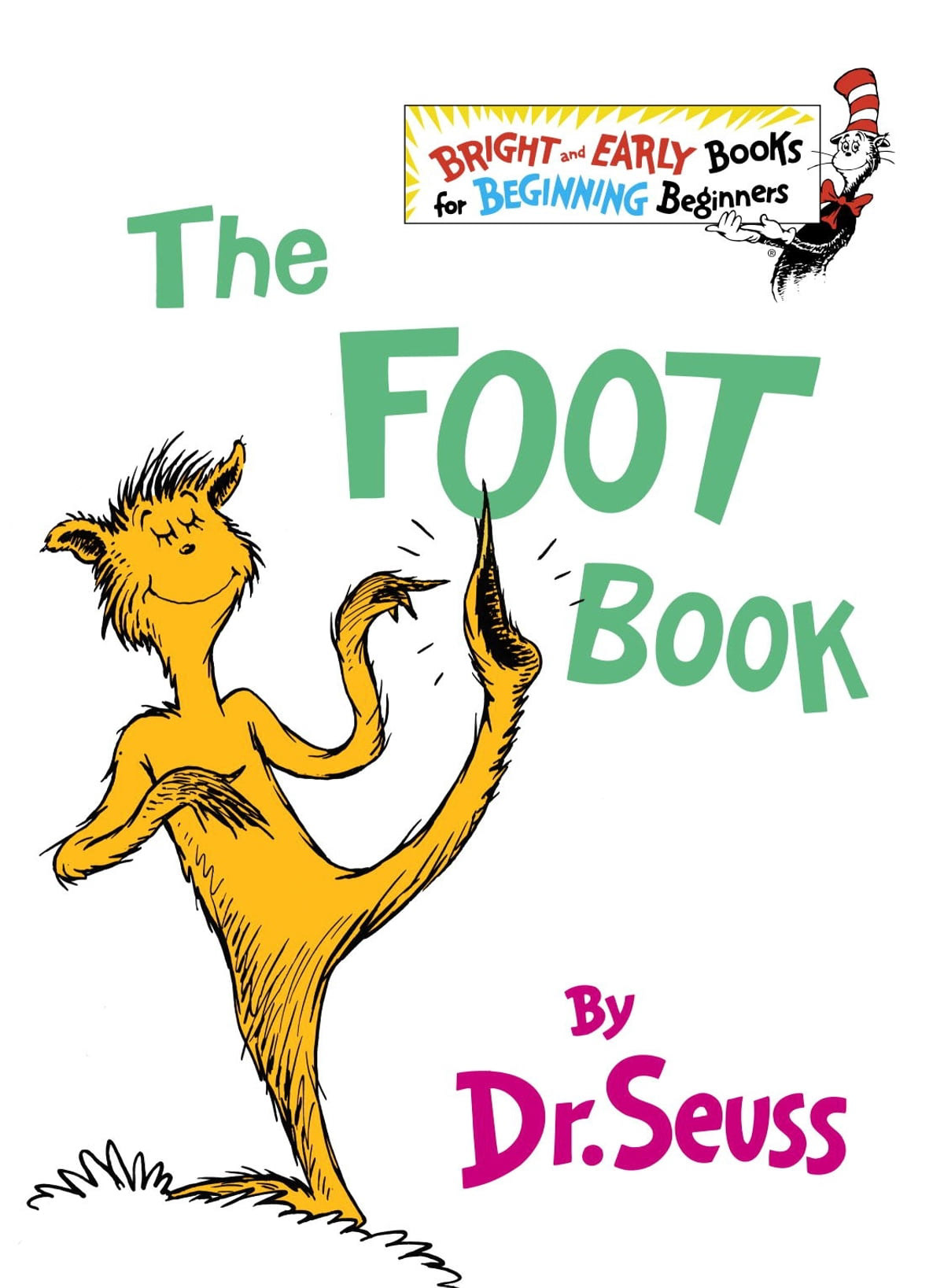
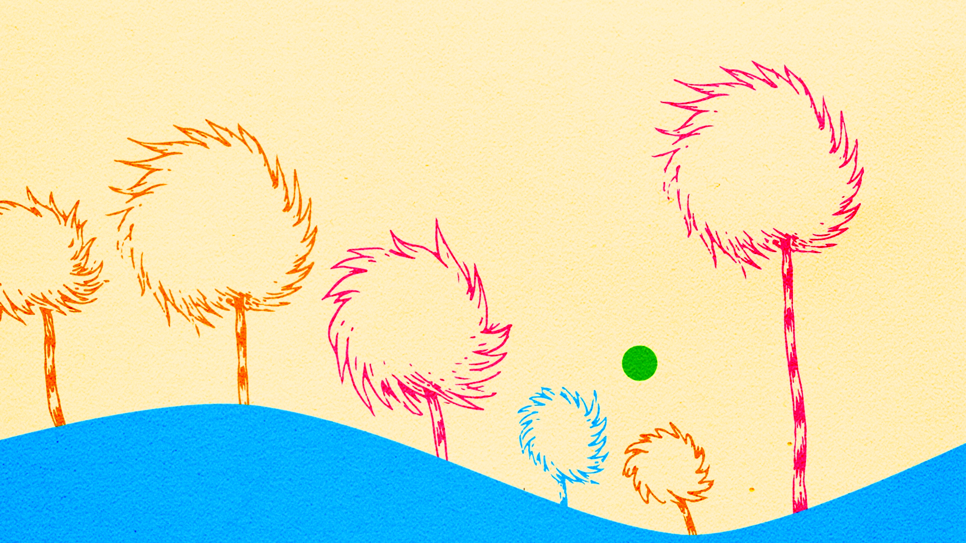
My research for this project was extensive, and went all the way back to my childhood. I read several different Seuss books and settled on borrowing colors from Oh, The Places You'll Go, The Lorax, and The Foot Book. The font I chose was even called Seuss!
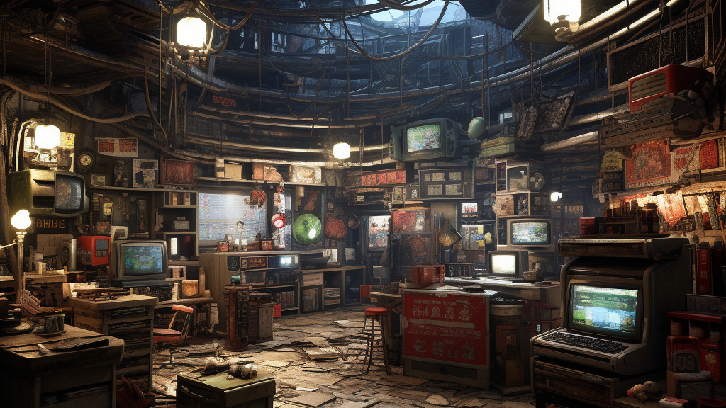
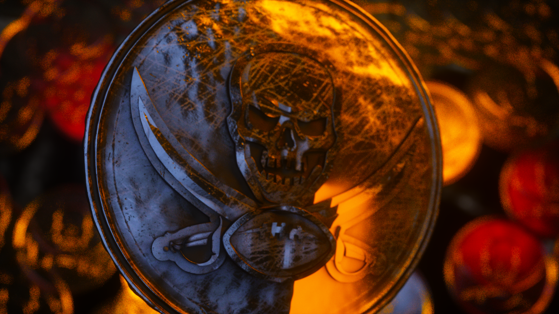
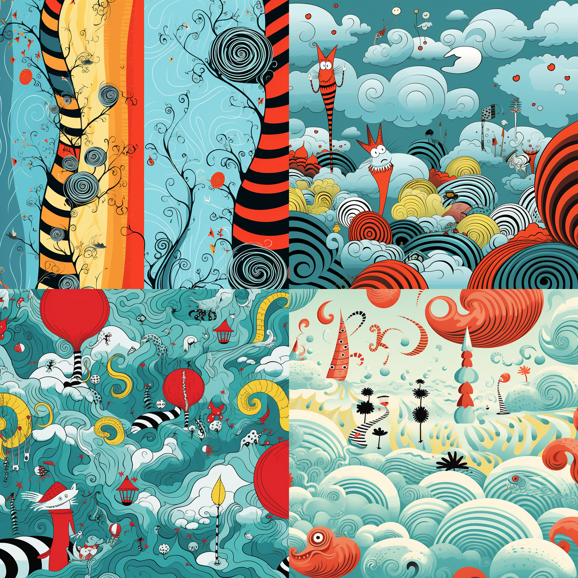
I played around with Midjourney to create some of these images, just finding palettes and shape language to further develop my pieces. These images are AI generated, but still pretty fun.
Initial Concepts
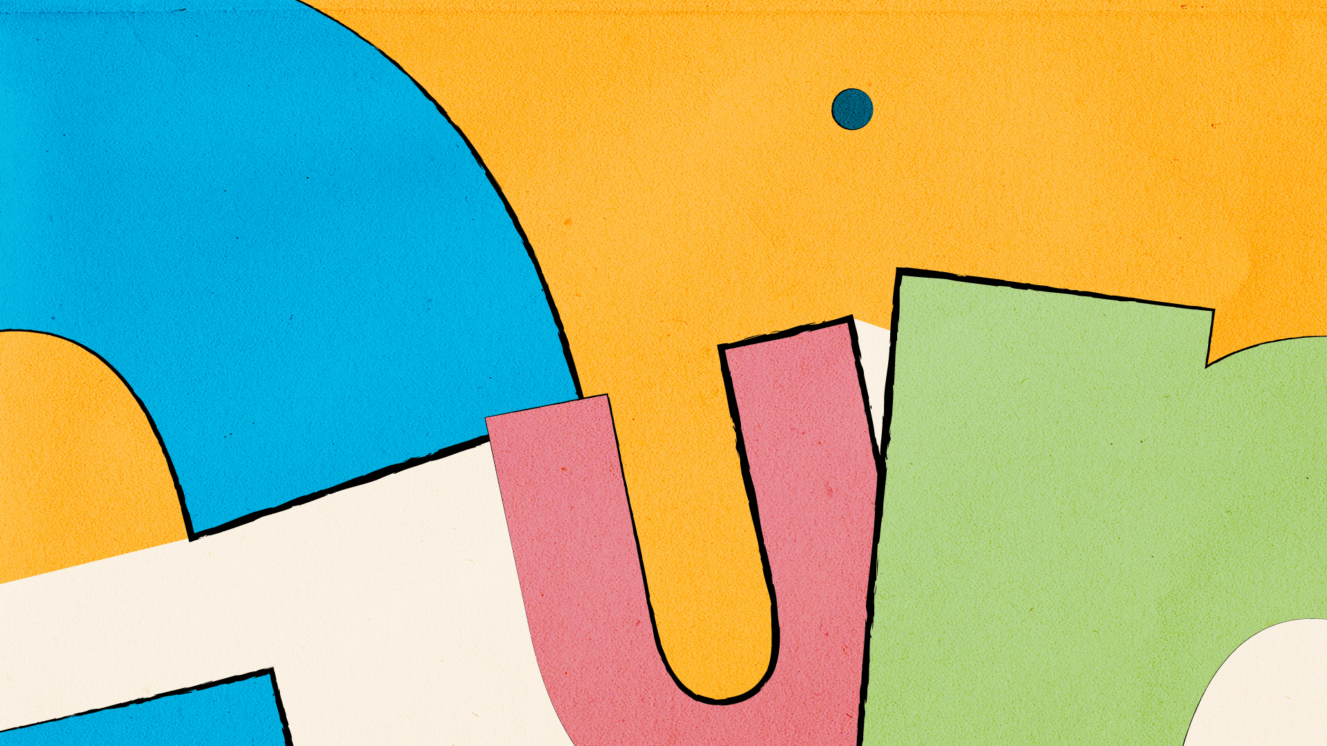
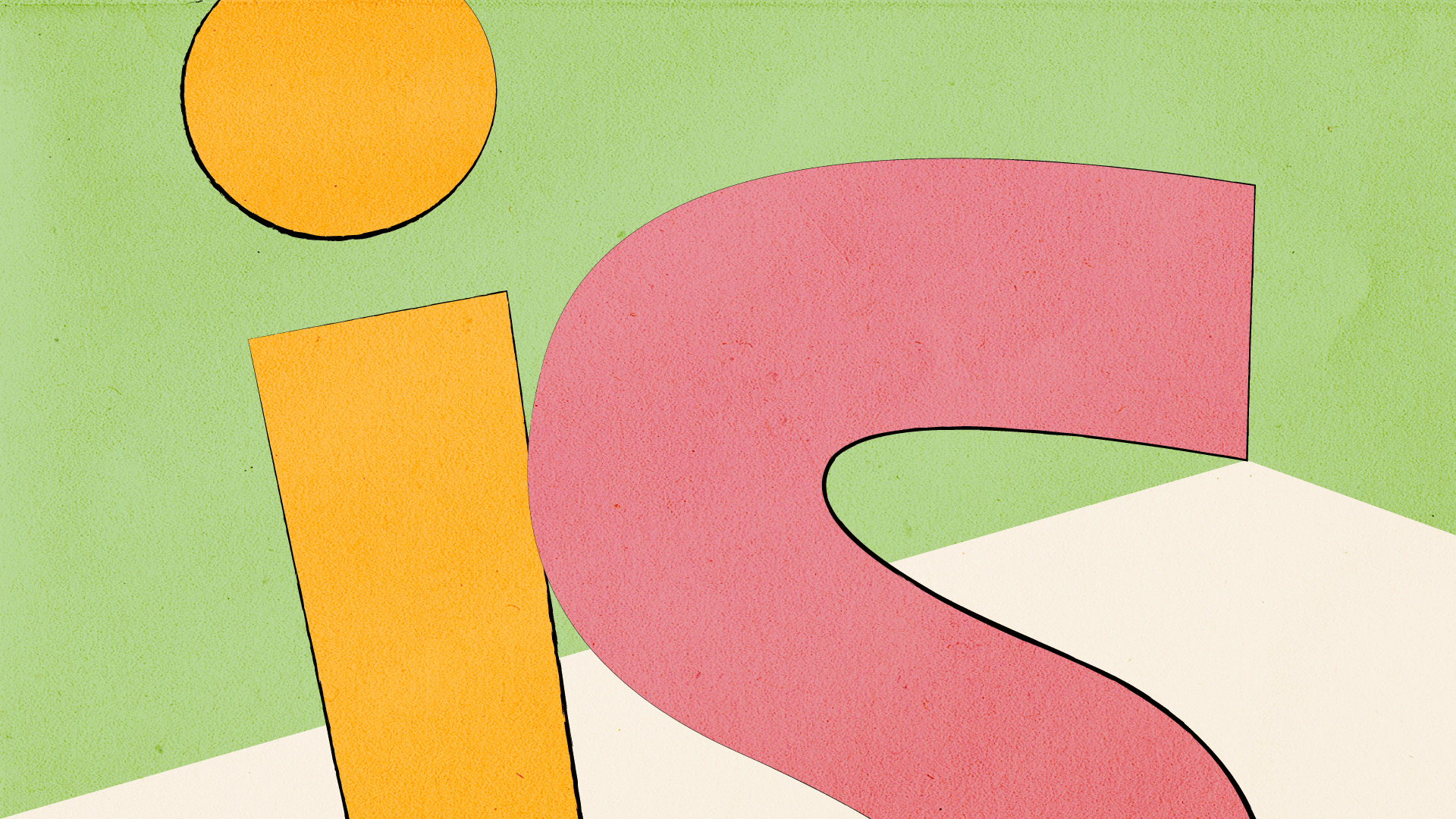
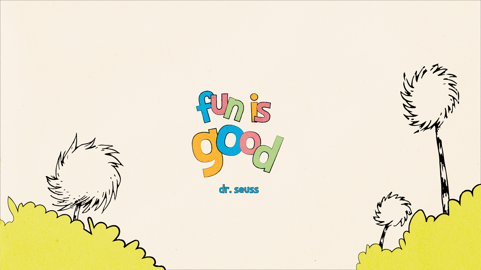

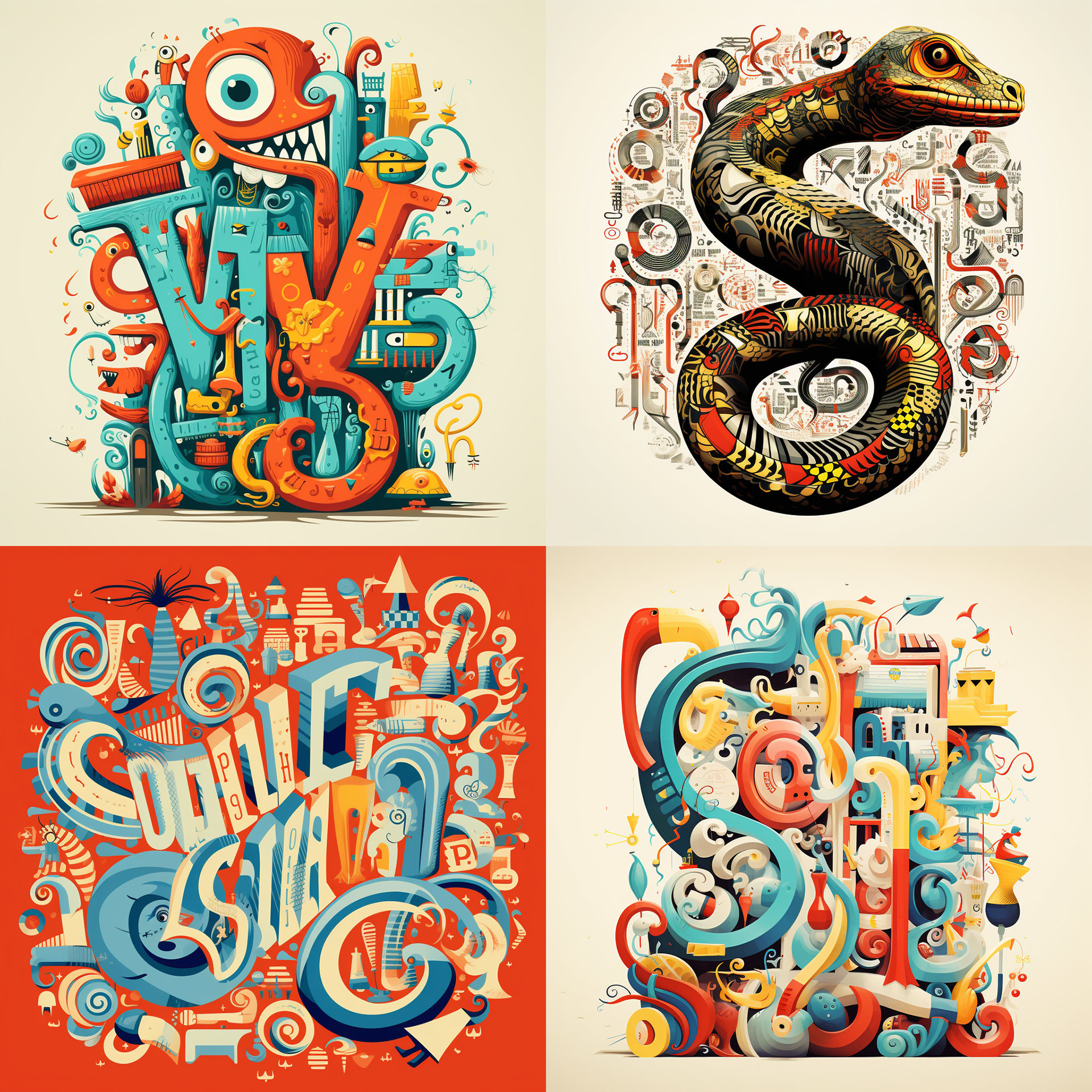
This project ended up being more challenging than it looked. With each pass I was missing something... the FUN! I tried hard to find the answer, and ended up scrapping my old versions at the suggestion of my Art Director and creating something completely different just days before the deadline.
These images were apart of my initial pass. They lack the vibrancy and the excitement that the newest images have. Although these are closer to Seuss's style, I needed to find a way to make my art more punchy. So, I lost the black outlines, upped my saturation, and played with compositions further.
The Notes and Passes
This was my first pass. A little rough around the edges.
+ Play with the sentience of the ball. Right now, it's unclear as is.
+ Black and white at beginning is not reading. Add a gradient to allow the audience to understand the transition from a "colorless world" to a "colorful world."
+ The letters need to play with the ball.
+ The animation doesn't need to be as long as it currently is.
+ Add sound for fun!
This was my Second Pass.
+ The animation is not fun enough. I can fix this by making the letters the character, and dropping the sentience of the ball.
+ Every frame should feel like a poster. I will make sure my stroke weight is consistent throughout the animation.
+ Use all of the frame for a more dynamic animation.
+ Writing on of the S does not read or work. I will find another way to make this more dynamic.
+ At the end, the dot on the i could be the ball. Scale up the ball as well.
This was my Third Pass.
+ The cliff jump is not exciting enough. I will revise this.
+ The movement of the letters at the end is not fun, find a different way to animate them.
+ The ball is still too small at parts.
+ Jazz music could be fun!
+ Potential to add other scenes throughout the animation.
+ What is the iconic part of this animation? Answer the question.
+ Camera shakes, ball could splat onto screen.
+ Use motion sketch to make animation more fun.
+ Possibly restart animation to improve fun qualities.
Final Animation
Requirements included a 16x9 format and a 1x1 format.

