This series of Animations was created from a brief for the Tampa Bay Buccaneers football team. After receiving the brief from the client asking for 3 animations (a countdown, call to action, and logo reveal), I got to work on a fun and exciting series that would capture the feeling of football.
This brief resonated with me as I wanted to exercise my skills with sports graphics, something I've always really been interested in. I also got to create this piece primarily in 3D, which was equally as thrilling for me.
The Styleframes
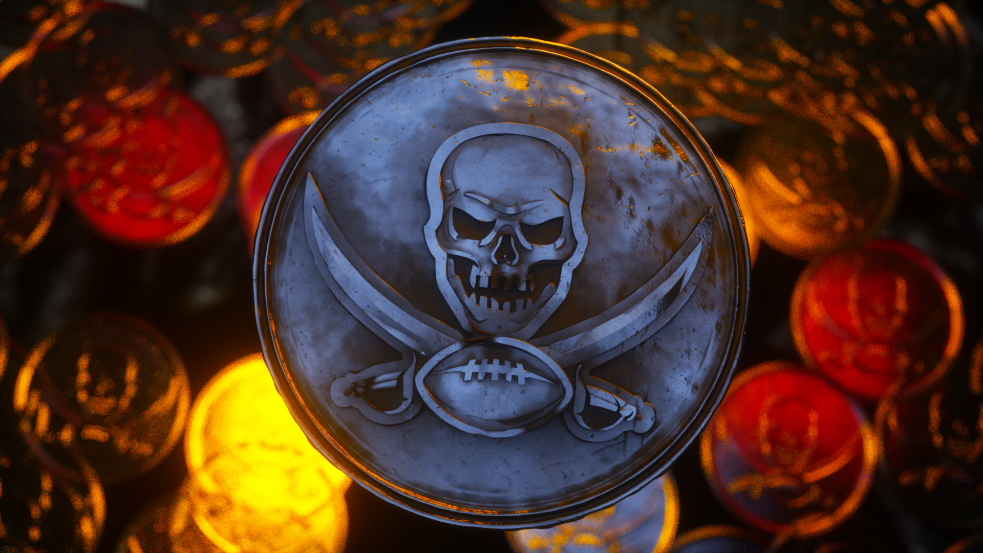

The Research
My research for this project was fun! I was able to scour through the social media of the Tampa Bay Buccaneers, look through their old case studies, and even was able to reach out to a member from their graphic design team.

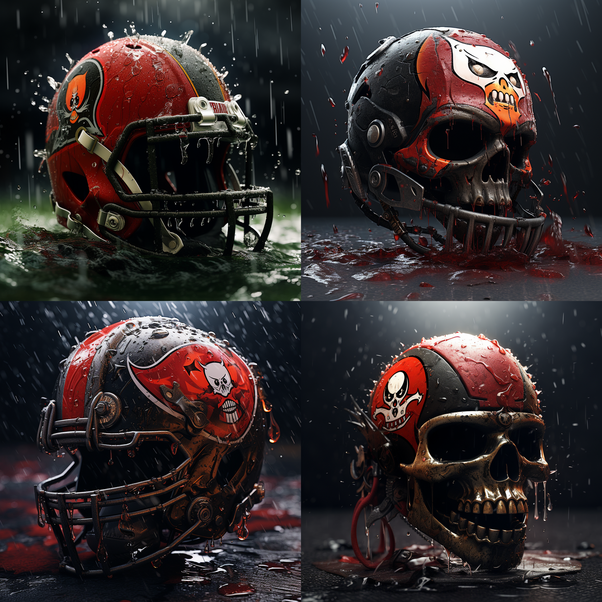
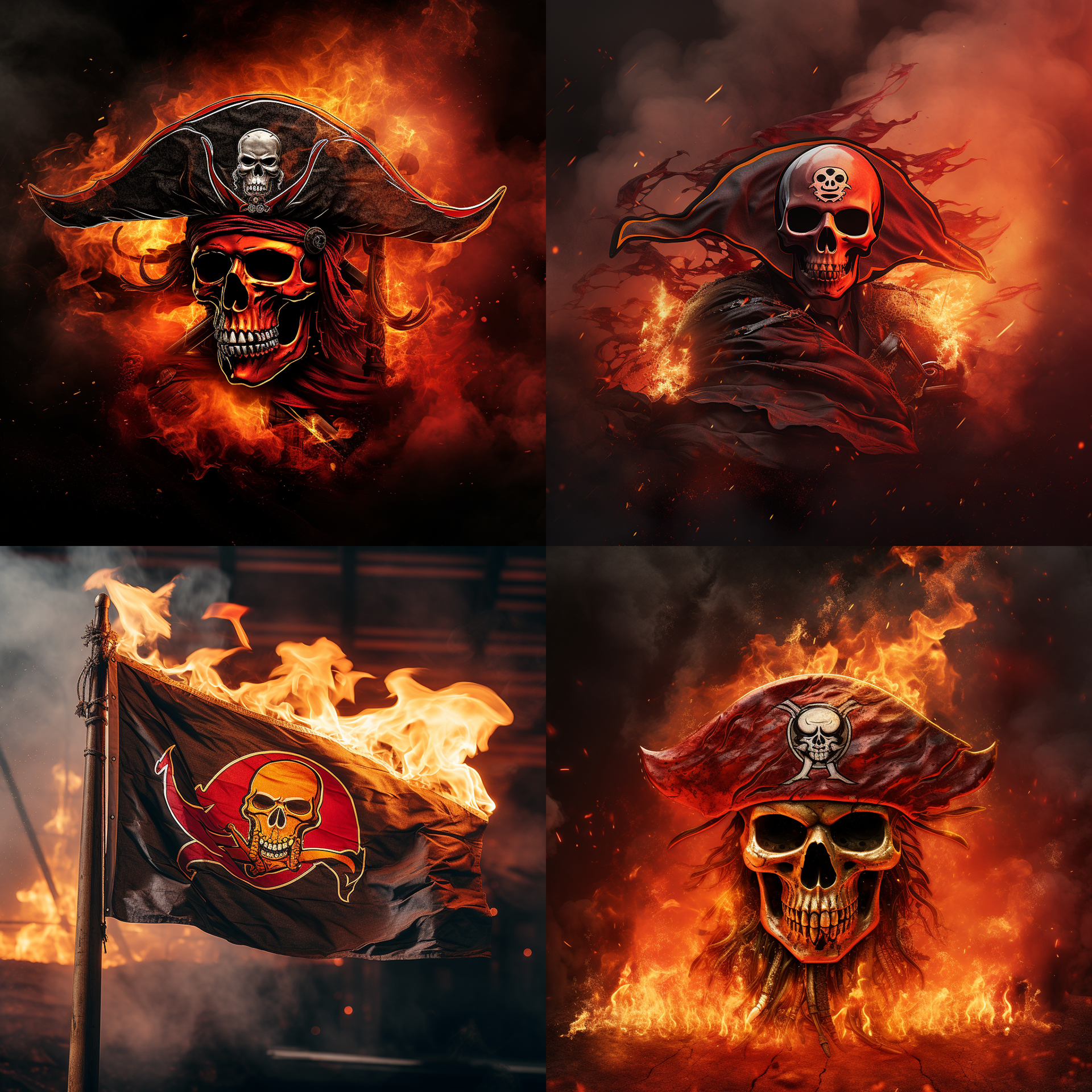
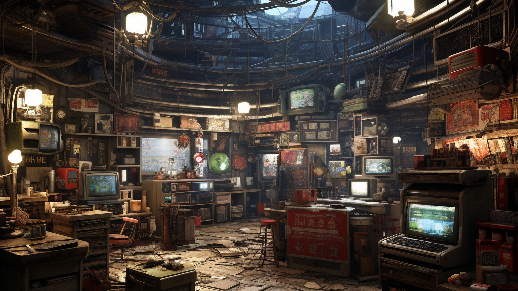
I also was able to utilize MidJourney for my brainstorming, which is pictured above. I loved all of these interactions. The picture to the left is from the Bucs 2019 Brand Package.
The Initial Concepts
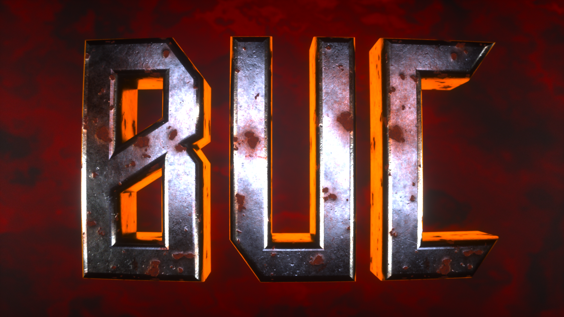
This project came to me pretty naturally. I was so excited to produce it. I started out by building things in Cinema 4D, lighting, and texturing. I knew what I wanted to do by the time the project was started, so I launched into production. To start, I thought about creating a piece as if it was being looked at through a spyglass by a pirate. This direction wasn't chosen, but since I had to pitch 2, I had my other direction ready to go... The thing that stayed from these intital passes was the phrase "Buc Them Up." It was simply too good of an idea to not use!

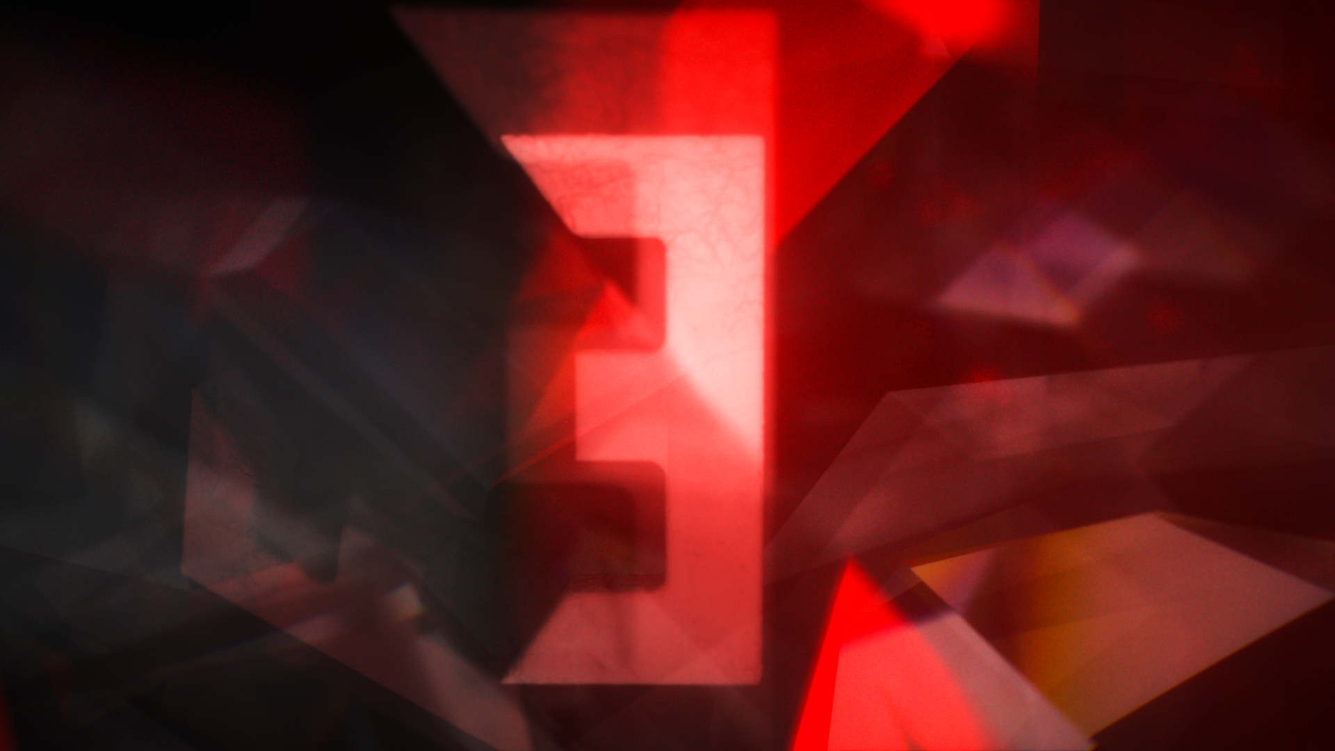

The Notes and Passes

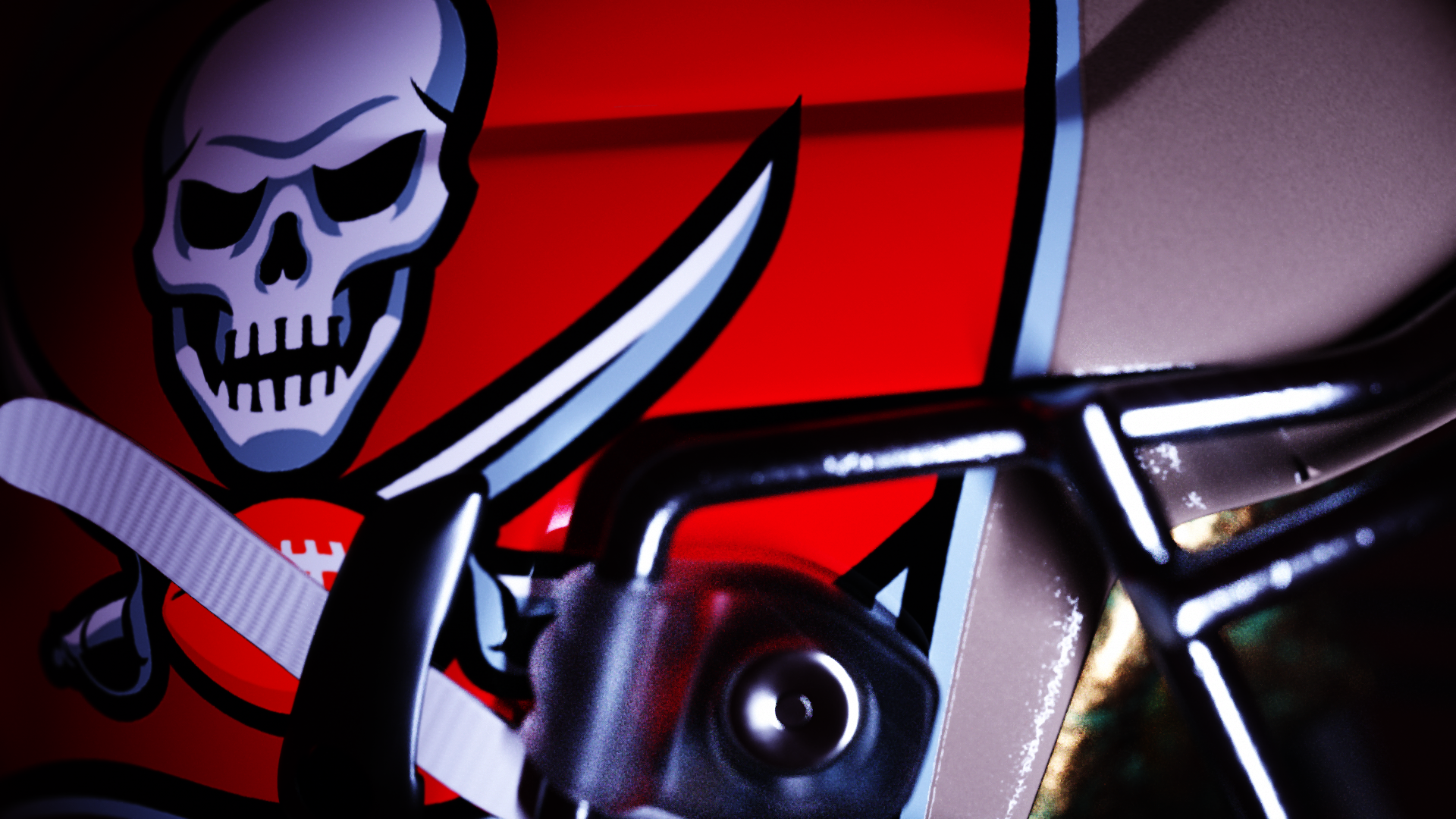
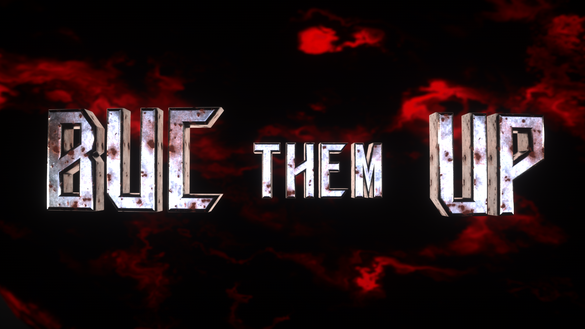
This was my first pass of styleframes. Not too bad, but not as refined as we like to see.
The helmet's lighting needs to be top-notch so it feels authentic. The coin's composition isn't super strong yet, and could be improved. Buc them up needs to be dynamic and in your face, because the phrase has so much potential.
This was my second pass.
Each piece was just way too dark to be readable during the day, so I was told to up the contrast and saturation. I also seem to have too much pink in my designs, so adding creamsicle will make it stand out as more of a Buccaneers animation. The coin also feels too perfect right now to be pirate money, so adding textures and giving it some more personality
This was my Third Pass of animation.
Some of my notes from last pass included some adjustments to the skull animation. Well, this time I over-corrected and made the skull animation much too obvious. I need to brighten up the helmet but make it more like my first pass. Buc them up feels a frame or two too fast, and the light is too yellow. Adding some VFX may enhance the piece too.
This is my fourth pass.
The flames are feeling a little heavy, and the coin still needs more of a parabola as it animates across the screen. The skull feels a little dark, and could use some more contrast to help the details pop.
The Final Animation

